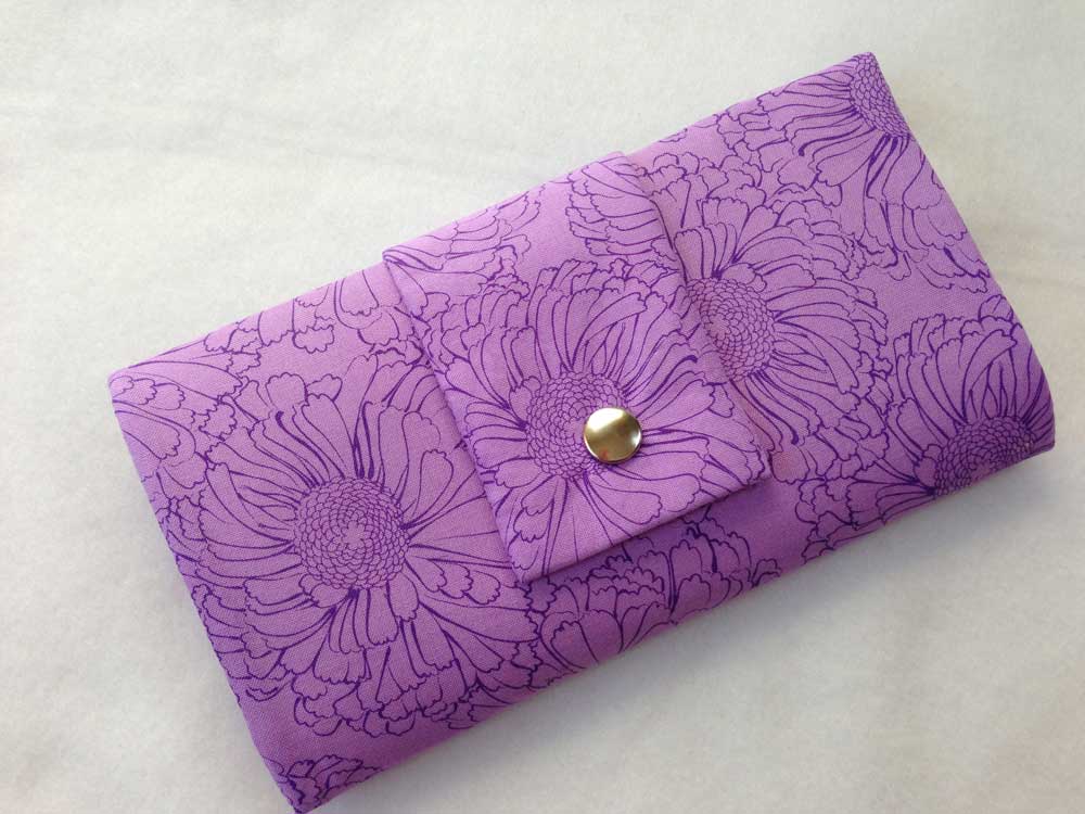
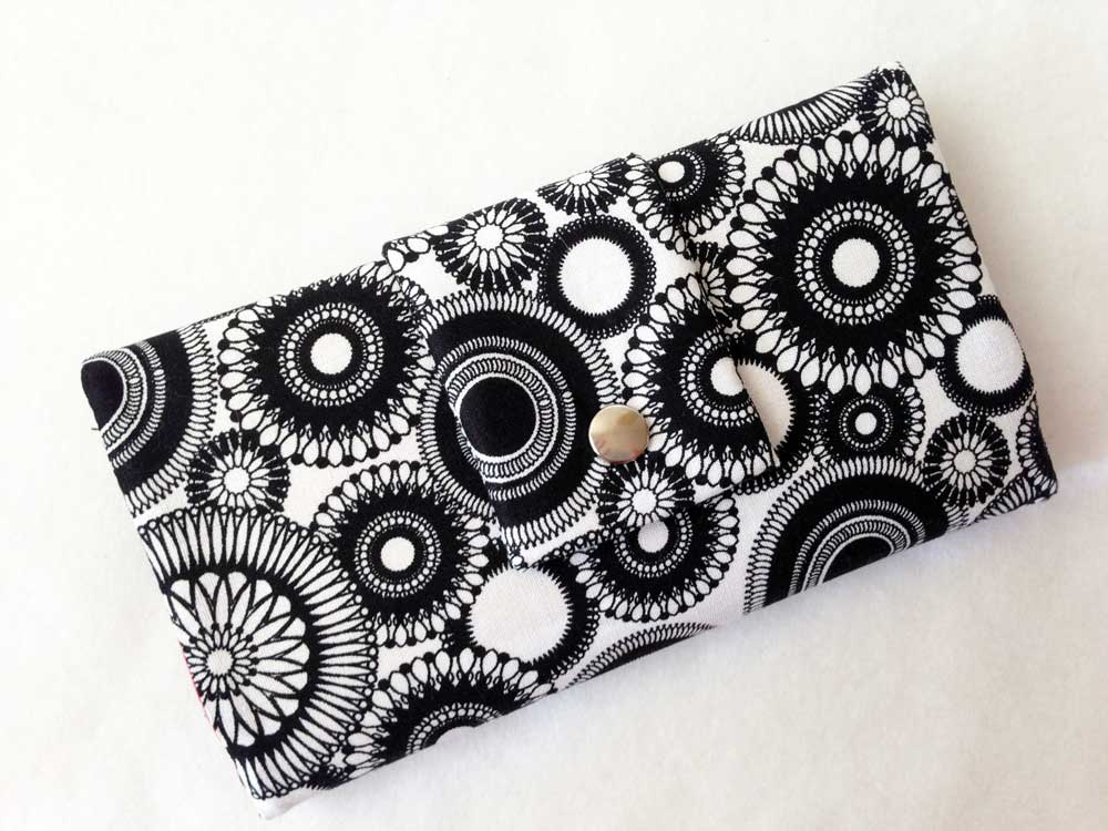
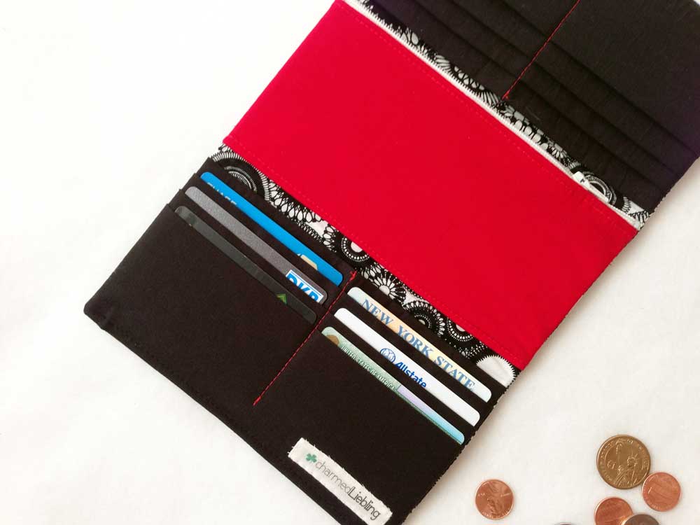
Take a closer look at the items in my shop and you will realize, I follow that color scheme A LOT. I just recently listed some new trifold wallets and my two favorites are these:
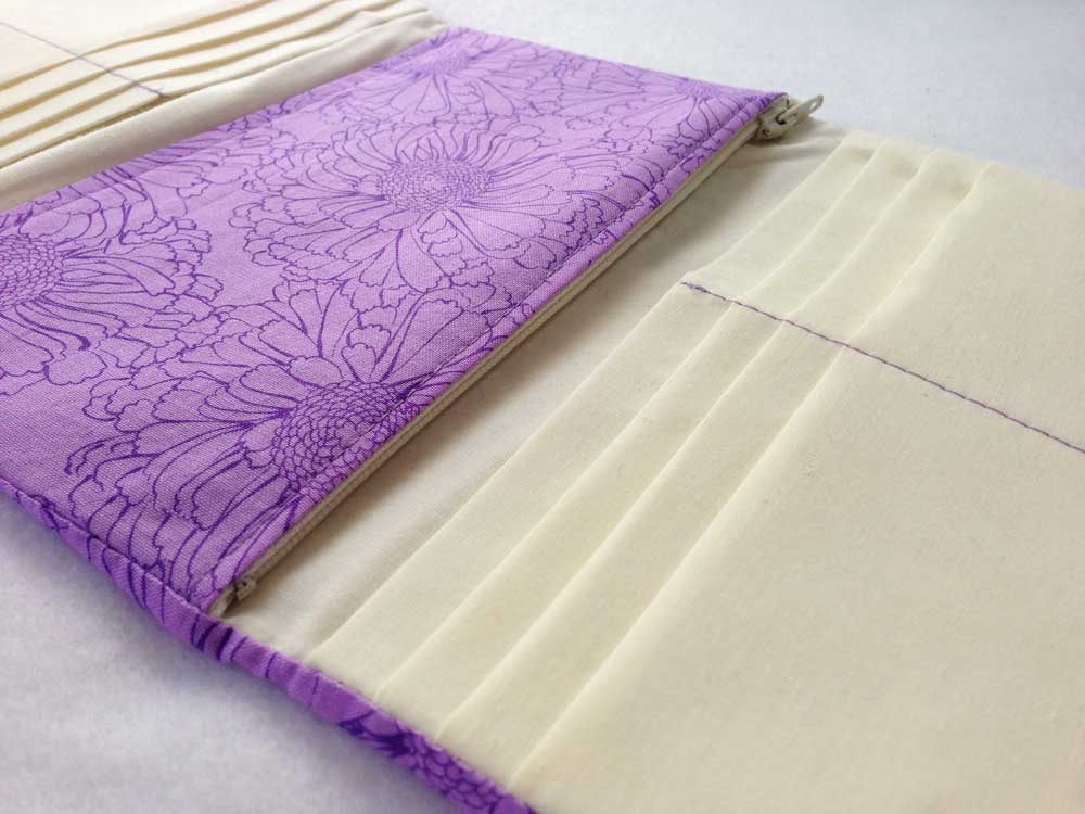
The purple vanilla one is one of my most favorite color combos ever. I personally love the bright purple floral fabric anyway but together with the soft vanilla tone on the inside of the wallet, it gets a whole different look.
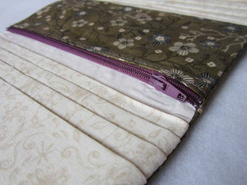
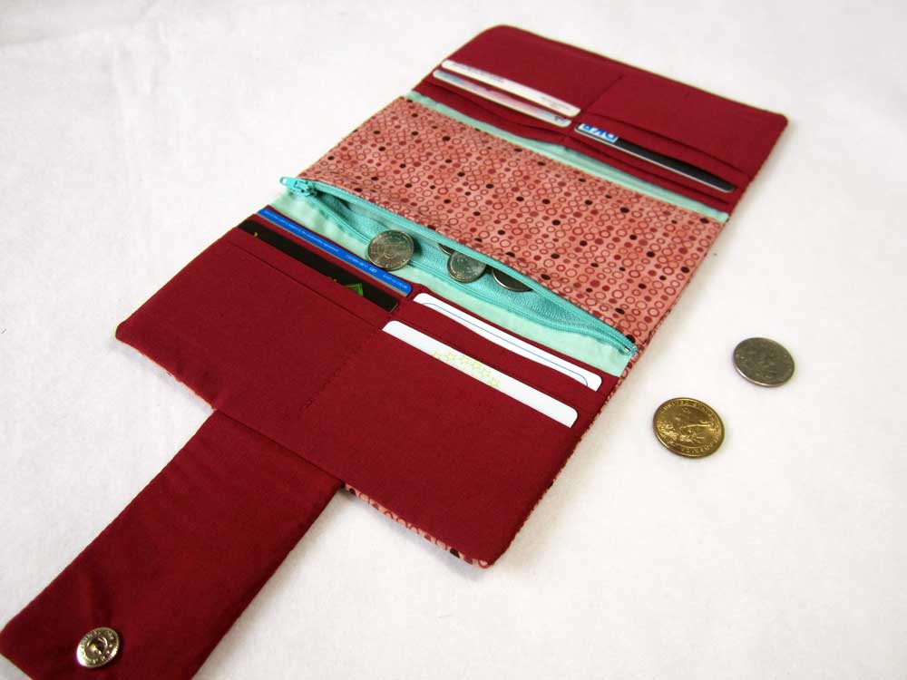
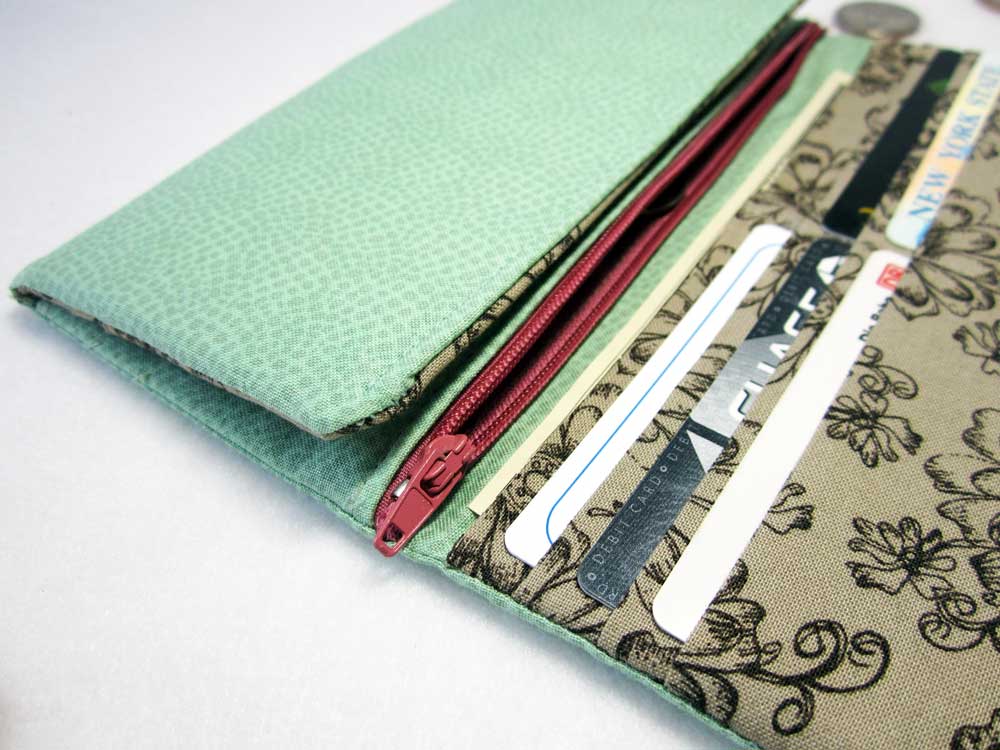
Sometimes it doesn't even have to be too obvious like in the examples above. If I have similar colors, I sometimes like to add just a little hint of contrast color, e. g. with a zipper or a little ornament. This is really a good idea, if you don't like a contrasting color to show off but to indirectly add a nice effect to the other colors of an item:


 RSS Feed

